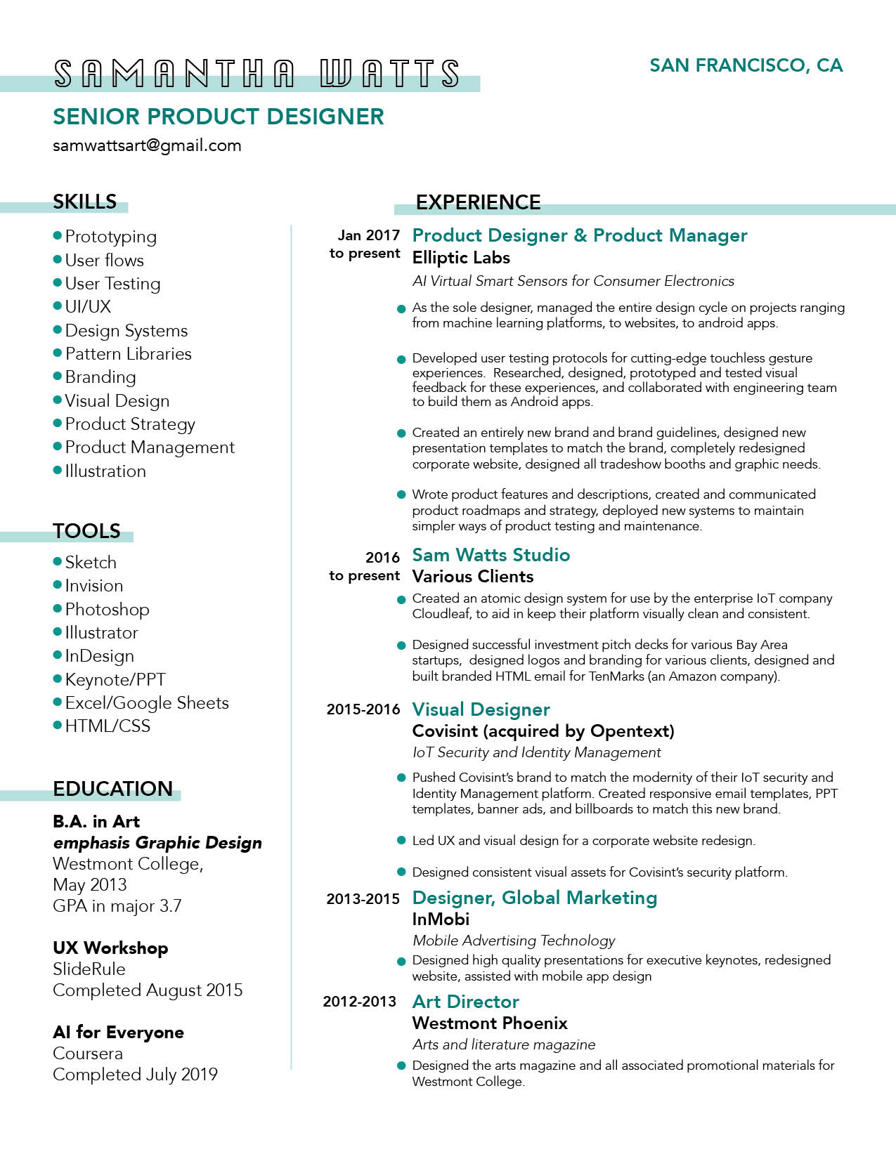
Resume


Project: Create a design system to aid in the visual and interactive consistency of Cloudleaf's intelligent sensor platform. I began the project by logging into their platform, and taking inventory of all the visual components that were in use. I presented this inventory to Cloudleaf's Head of UX as a starting point for our discussion of where inconsistencies currently existed, and what sort of design system framework would best suit their needs.
Elliptic Labs needed a website that better explained what they do. The site also needed to be more visually appealing, and match the updated brand I'd created for them. I architected, designed, and built the website using a Wordpress framework. A video of the site can be viewed below and the final site can be viewed live at ellipticlabs.com
There have been several smartphones recently released, including Google's Pixel, that have a touchless swipe gesture. They all use either a camera or time-of-flight sensor. Elliptic Labs is also working on a touchless swipe gesture, using only ultrasound and the hardware that’s already common across all smartphones. We’re looking to make it as clear and seamless an experience as possible, and needed a demo app for the OEM partners that we’re working with. This experience was made for a specific phone, for one of the world’s largest smartphone manufacturers. My Role: I was the product designer and product manager for this project. My main design role was to find a way to provide visual/haptic feedback for when the swipe gesture is available and when it is successful/unsuccessful. We needed this visual feedback to clearly guide the user toward more successful swipe gestures, without detracting or distracting from the rest of the experience. Below is a video of the final experience. Keep scrolling to see the full process.
Overview: This was a user test I designed and led to help Elliptic Labs decide between three possible versions of a "zoom" gesture experience. I conducted these tests with the help of my interaction design intern at the time. We used this testing process to determine if zoom was an experience we wanted to create, and what exactly that experience would look like. It was also used to gauge public interest in this product within our target demographic. What we were building was a touchless gesture experience that reused the hardware sensors already present in all smartphones. This experience allows a user to easily zoom in and out on their phone screen, while using only one hand. We tested this gesture in a variety of applications, including photos and maps. The specific test described here was for a photo experience, to zoom in after taking a selfie. The task for the user was to perform a gesture the "move" the image closer to their face to zoom in, and to move the image away from their face to zoom out. This is a natural way of mimicking how people already bring real-world objects closer to their face for a more detailed view. How was the test conducted? The first round of user testing happened in California, on the campus of UC Berkeley. We specifically chose to test at UC Berkeley because of the high concentration of people between the ages of 18-22 (our target demographic). Users were recruited on campus, asked to fill out a demographic form, and then shown a demo. This was the demographic form we used.
36 Day of Type is a yearly open call inviting designers, illustrators and visual artists to share their view on the letters and numbers from our alphabet. I've participated in it for the last two years. My typeface for 2019 was entirely hand drawn, using the software Procreate.
An exploration of the payment process for mobile ecommerce. I researched what was and wasn't needed to complete a credit card transaction, along with what information a native app would already have on its users. This was created to show some of the ways that the current process for mobile payment could be simplified. To create this clickable prototype, I started with user research on the pain points currently involved with mobile ecommerce, and ways this could possibly be eliminated. Then I moved into sketching the IA of the app, then onto extremely low-fi sketched flows and wireframes. Finally, I moved into the second stage of low-fi wireframes, before creating the visual design and the clickable prototype.


